OK, “everything” is a strong word, but the following charts on the cost of solar panels should be super useful to you. Of course, to get a very specific cost of solar panels estimate for your own home, just spend about 60 seconds answering a few question at the link above and we can hook you up with this in a jiffy. (A completely free process, of course.) But, if you’re just interested in some general information on the cost of solar panels, look no further, we’ve got the goods right here:
10 Cost of Solar Panels & Cost of Solar Power Charts
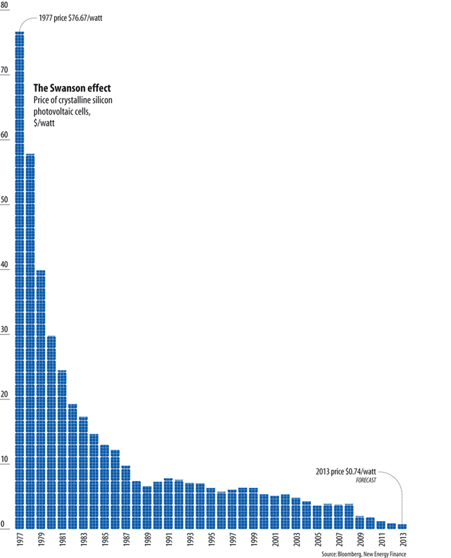
1. The average cost of solar panels has gone from $76.67/watt in 1977 to just $0.698/watt today (the second figure is according to PVinsights, and is even lower than the 2013 projected price in the chart below).
Data Source: Bloomberg New Energy Finance (BNEF)
Chart Source: Unknown

Screenshot of portion of PVinsights.com
Well, that basically tells you everything you need to know right there — the cost of solar panels today is about 100 times lower than the cost of solar panels in 1977 (even mopvre than 100 times lower!) — but I promised 10 charts, so let’s dig in even further and throw on some other fun charts and graphs.
2. What is really important is that the cost of electricity from solar panels is now lower than the cost of retail electricity for most people.
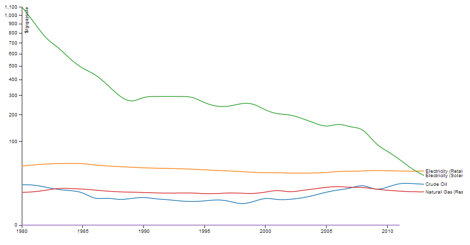
Image Credit: Brian McConnell, Resilience
That’s big! That means that people like you and me (if we have a roof) can cut our electricity costs by putting solar panels on our roofs! This is why major companies like Walmart, IKEA, Google, Apple, Facebook, Costco, Kohl’s, Macy’s, Staples, and many others are starting to go solar in a big way.
Of course, as you can see in that graph above, the cost of solar is headed towards the wholesale cost of electricity from natural gas… which would actually get utility companies and power plant developers switching to solar in a big way. (The cost of solar power actually varies quite a bit from place to place, and solar has crossed those lines in some locations.)
3. Here’s another look at the falling cost of solar panels (or, as the industry calls them, solar modules), focusing on the years 1985 to 2011:
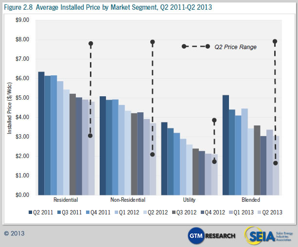
4. Are you actually interested in the cost of installed solar power systems? And even perhaps the cost of installed solar power systems by sector? Here’s a chart on that, for the US, up through the second quarter of 2013:
Source: GTM Research / SEIA
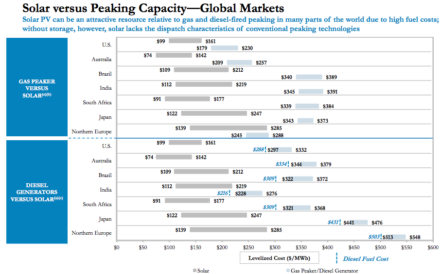
5. Are you interested in seeing how the cost of solar panels compares to the cost of its main competitor? If so, have a look at this comparison between the cost of solar and the cost of electricity from gas- and diesel-fired peaking power plants:
Source: Lazard
6 & 7. Are you interested in seeing how much solar panels save the average American who goes solar… or even the average person in California, Florida, New York, Texas, Hawaii, and so on? Below are two infographics on just that. Just note, however, that these averages are based on the cost of solar panels in 2011 (as I think you’ve gathered by now, the cost has dropped considerably since then).

Source: Cost of Solar (us)

Source: 1BOG / Clean Power Research
8. So, with all of this information on the drop in the cost of solar panels and the cost of solar-generated electricity, you’re probably thinking that solar power project growth should be going through the roof by now, right? Indeed, it is:
9. That’s for solar power growth across the world, but the story is the same for solar power growth in the US:
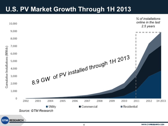
Source: GTM Research
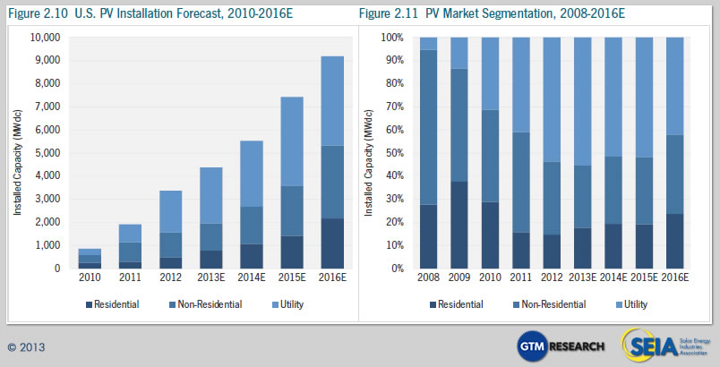
10. With projections for the coming few years:
So, what’s the lesson today?
The lesson is: the cost of solar panels has fallen off a cliff, and that means that solar power now crushes electricity from the grid for a huge number of people. If you have a roof and don’t have solar panels on it, stop wasting your time and see what the cost of solar is and how much you can save right now!
Leave a Reply
Solar Savings Calculator
Get the facts. Find out exactly how much solar will save you, including which Tax and Financial programs you qualify for!



Leave a Reply