


The solar power trend is undeniable. Solar power’s growth curve is so steep that anyone with half a brain cell can see that it is going up for a long time to come. Below are 4 recent charts on this topic that I think everyone in the US should see. So, please, check them out and then share them with your friends, families, and people on the street!
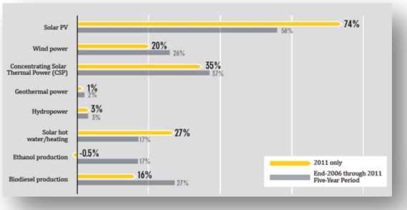
Here’s is some solar power growth looking to jump off the charts. This first chart shows annual capacity growth rates for renewable energy technologies. As you can see, several renewable energy technologies have seen strong growth, but solar thermal power’s growth rocks, and solar PV’s growth crushes it!

This next chart puts that tremendous growth in another form.

Look at that growth! It’s like what we saw with cell phones, computers, refrigerators, and many other commonplace technologies as they surged to dominance.
Lastly, here’s another fun one on how extremely fast solar thermal power is growing.
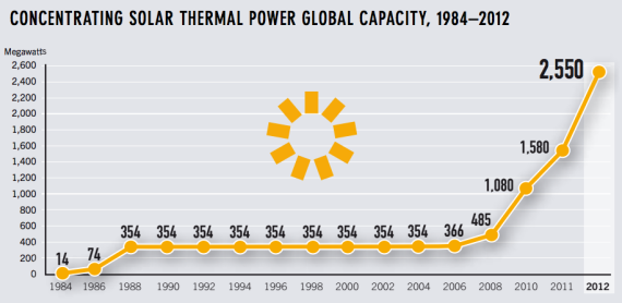
Notably, if you think that the solar thermal power number above looks much higher than the solar PV number, just note that the solar PV chart is in gigawatts while the solar thermal chart is in megawatts. In gigawatts, solar thermal power would be at 2.55 GW, far less than solar PV’s 100 GW.
Image Credits: Ren21
Leave a Reply
Solar Savings Calculator
Solar Savings Calculator
Get the facts. Find out exactly how much solar will save you, including which Tax and Financial programs you qualify for!

